Over the last few years, I have struggled with that question for the microbiome.
Value of an Average — ZERO!
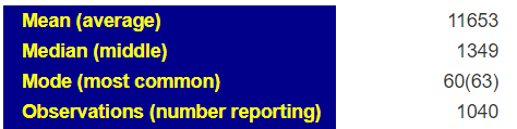
Often we see on the report something like below. The problem is how WIDE is the healthy range! We have no idea!

Value of a Normal Distribution Range?
The industry standard for medical labs is simple, compute the average and the standard deviation of a healthy population and then set the range to be two standard deviations above or below. This is the cheapest because you only need a sample sample.
An alternative is to take a much large group of people and then rank order them. The range is obtained by looking at values between 2%ile to 98%ile or 5%ile to 95%ile. This is rarely done because it costs a lot more to do sufficient samples (instead of 30 people, you may need 300 or more)
The first approach depends on it being a “normal population”. Normal population means one that matches the gaussian distribution (sometimes referred to as a bell curve).
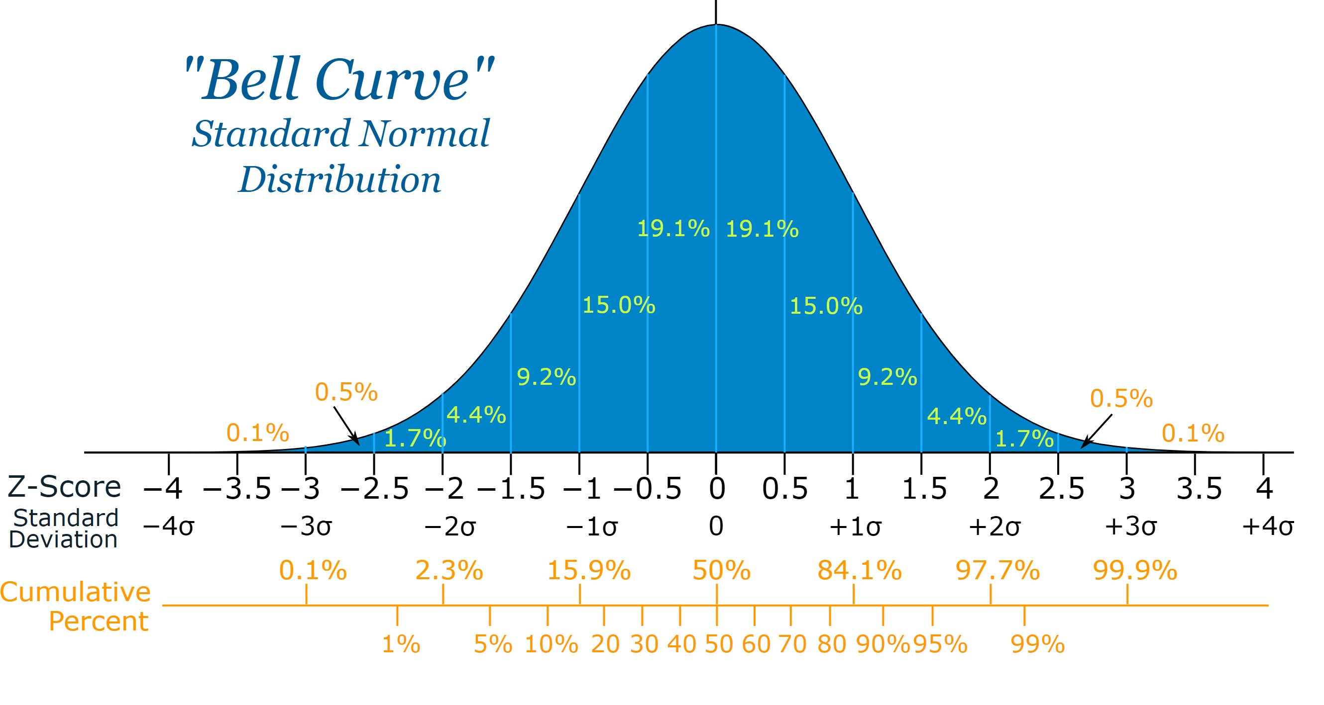
To test if this is true:
- The most common value (mode) should be the same as the average(mean)
- The middle value(median) should be the same as the average (mean)
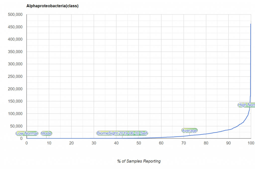
With the microbiome this appears to be always false!
The curve looks nothing like the expect bell curve. This approach is simply, and grossly wrong!
The second way is better except the choice to exclude the top or bottom 2/5% is arbitrary. It is arbitrary and underneath the cover, there is still a strong assumption that this is a bell curve!!!!
Box-Whiskers
This is an exploratory method (see the history here) that uses quantiles to group data. The 25%ile, 50%tile and 75%ile are obtained from the data. the box is 25%-75%ile. The distance from 25% to 50% is used to create he bottom whisker. The distance from 50% to 75% is used to create he bottom whisker. Numbers outside of the whiskers are deemed abnormal.
The chart below illustrate the effect. It is better than using means and standard deviation when data is not a bell curve. There are different algorithms in use and there is no mathematical theory behind it.
Expert Ranges – Clinical Experience
These are usually done for only a few bacteria (major ones) and based on experience dealing with patients. They will often be bias towards the population that they treat. The choices are subjective and observational.
They are often better than the methods above, but they are incomplete and biased.
Kaltoft-Molftup Ranges
This is a proprietary algorithm which is not medical or microbiome centric. It’s a pure mathematical approach that works off the shape of the data. In terms of mathematics, you construct an appropriate b-spline and then inspect different derivatives.
To give a simple analogy of how it does it, consider the question of determining the rich and the poor in the US. You may get a chart like the one below (boy, it looks almost like the bacteria curve above!). Where does the abnormal rich or abnormal poor start? It is really not clear. You will have people say “top 2%, top 5%” or “bottom 15%”. All of these are often numbers pulled out of the air!

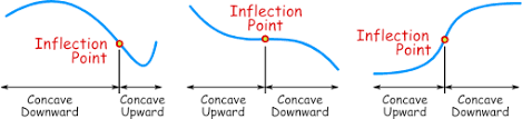
If you transform the data as shown below, you will see that the middle section is a relatively straight line. The middle class (literally!). Where the curve bends is where the poor and the rich starts.
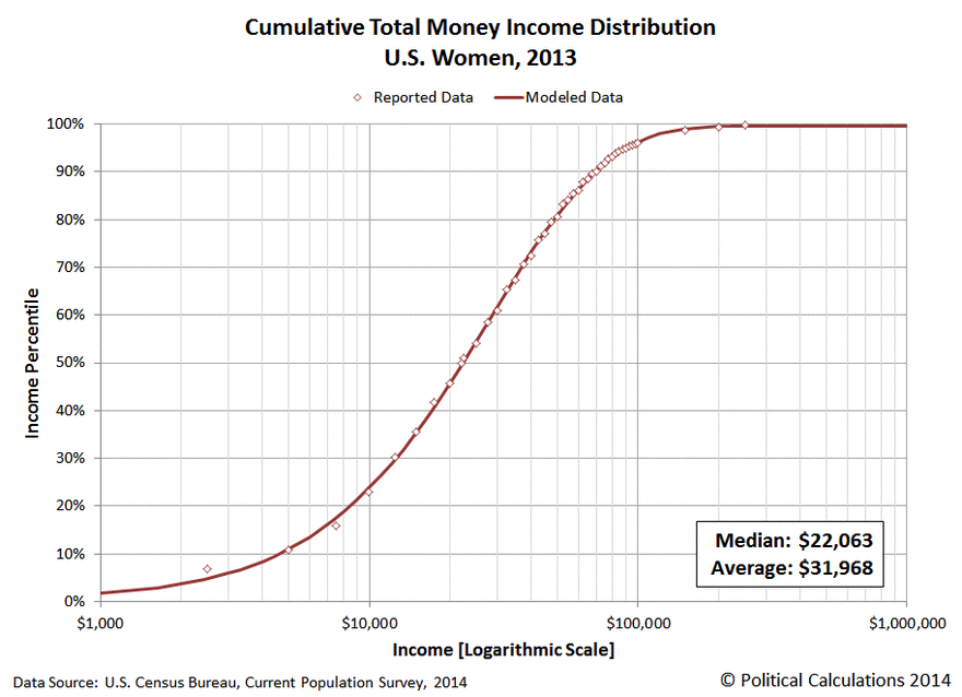
The Kaltoft-Moltrup algorithm determines these behavior inflection points.
Bottom Line
IMHO, The KM algorithm is a superior estimator of ranges because it is based off the shape of the data and not assumptions about the nature of the data (i.e. a bell curve). Every bacteria will have a different range. In fact, each bacteria for a specific age range, diet or gender, will likely also have different ranges.
Addendum: A comparison of extreme 3% selection to KM selection
Recent Comments