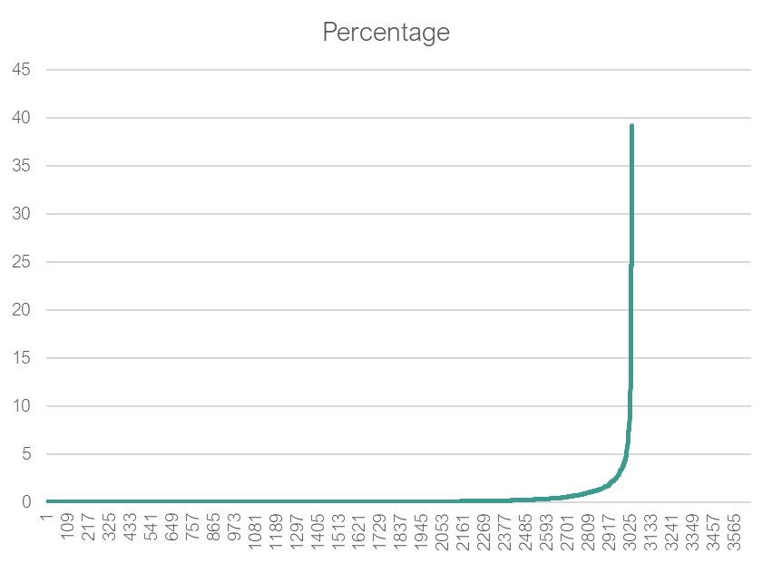
To illustrate this, we use our collection of distinct microbiome samples processed through BiomeSight (N: 3656).
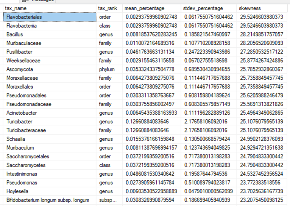
Species: Phocaeicola massiliensis
Basic Statistics;
- Minimum: 0.001 %
- Maximum: 89.1%
- Median: 0.254%
- Mean / Average: 7.6%
- Mode: 12.4%
- Standard Deviation: 14.6%
- 5 Percentile: 0.009%
- 95 Percentile: 43.7%
- Harmonic Mean: 0.035%
- Geometric Mean: 0.445%
- Skew: 1.5
- Kurtosis: 0.035
When we apply Stats Class 101 methods, we get:
- Mean +/- 1.95 SD ==> (-21% to 36.2%)
- Box-Plot-Whiskers ==> (-9.4%, 15.8%)
WAIT: Having negative amount of bacteria!!! That is absurd!
What we should see if data was normal
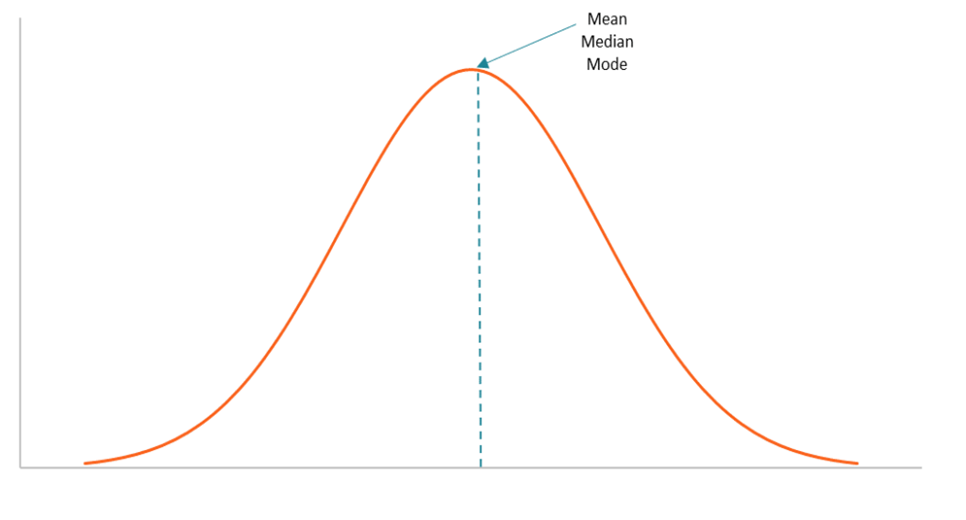
Wait, Mean, Median and Mode should be next door to each other!!!
What do we see when we chart this data. The charts are identical — NOT!
What should be used to compute range?
There are many better suited statistical methods. A few are:
- Kolmogorov-Smirnov test
- Kruskal-Wallis test
- Wilcoxon signed-rank test
- Mann-Whitney U test
- Bothe/Z-scores
- Median Absolute Deviation
The key thing to remember is that we are dealing with very skewed data.
My Preference: Kaltoft Møldrup Algorithm
The basis of it is doing a data transformation, then taking derivates to get an almost straight line. When the data leaves the line is where it is deemed to be abnormal. The following diagrams illustrates the process.
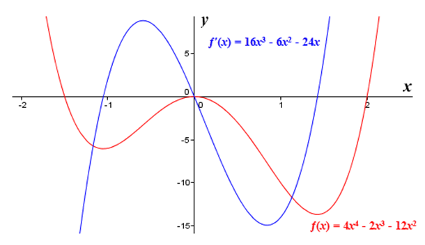
Example: Original Data
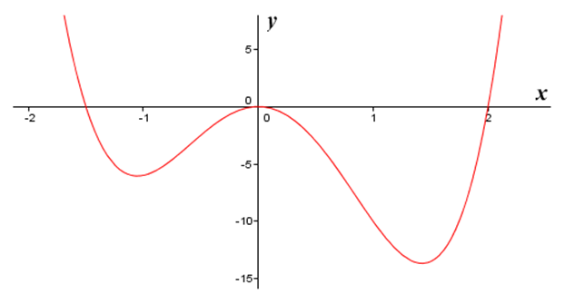
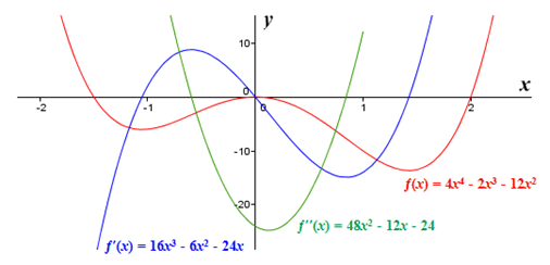
2nd derivative line
3rd derivate line
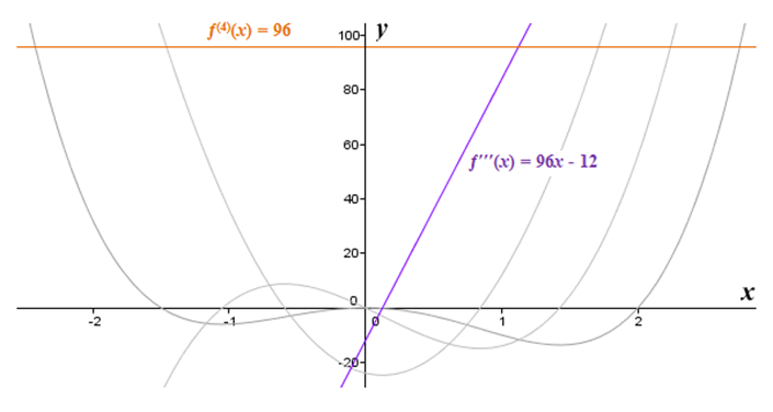
4th derivative line (where we see the desired straight line in purple)
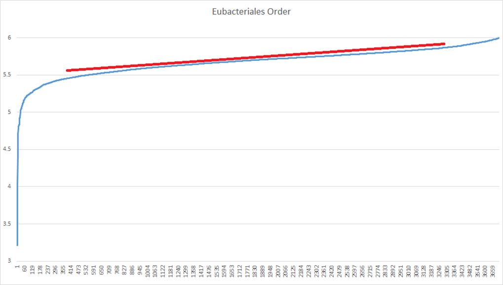
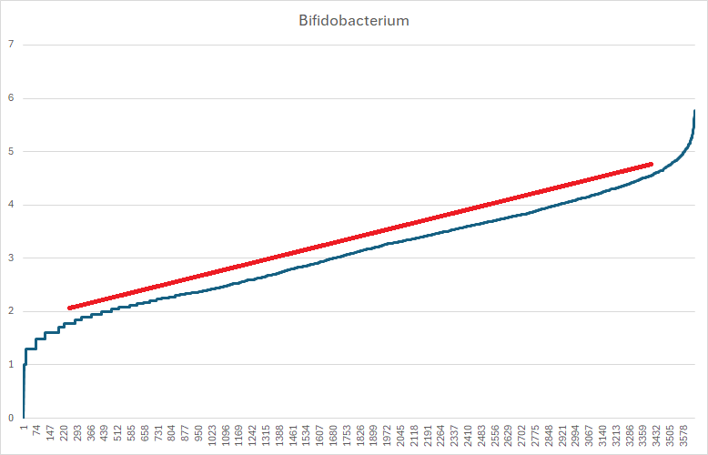
An example with real data. Most of the abnormal data is at the bottom in this example
Another more complex example indicating more complexity in the bacteria behavior in situ of the microbiome.
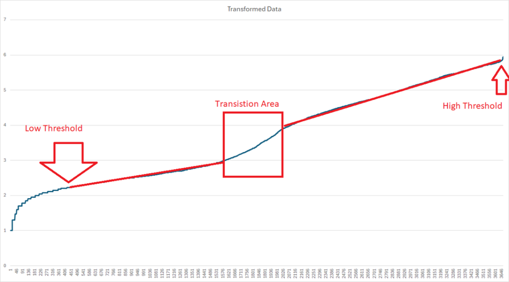
Another example showing both high and low abnormal areas
Bottom Line
Many suggested ranges are based on mean and never tests if methods that apply to a normal distribution/ bell curve applies. A small number of ranges are based on percentiles, i.e. over 95%ile or below 5%ile. Using percentiles is better but as suggested by the last curves above, this does not suggest evidence of being abnormal.
The Kaltoft Møldrup Algorithm appears to identify abnormal values in the classic sense of abnormal. It does require significant mathematical and statistical skills.
Recent Comments