Lazy versus Old School
I have observed that many data scientists tend to push data into a model and report the results of the model. I am old school and was taught to always chart the data to look for abnormalities. Doing that revealed that microbiome data is highly skewed. I covered this in Microbiologist / Data Scientist Guide to Bacterium Statistics.
I subsequently came across an odds plot where we have an appearance similar to electron shell densities and not the nice linear model that is often assumed.
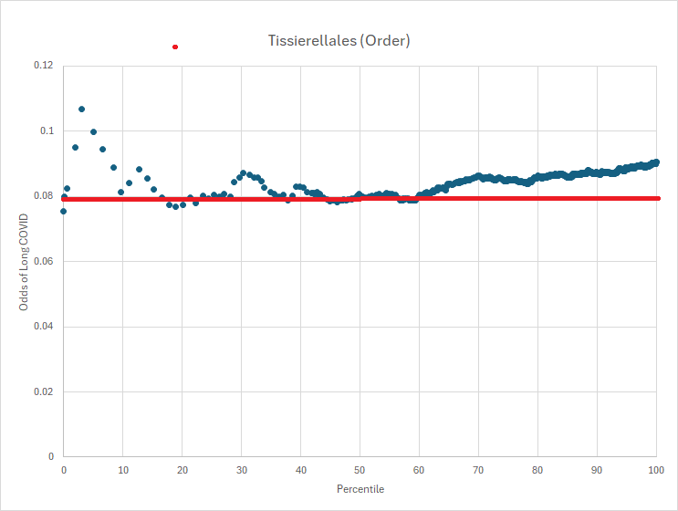
The result was a clear need to review a lot more data graphically. There are the main patterns:
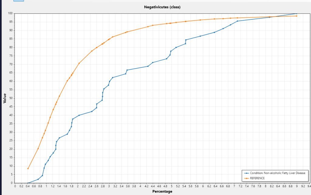
- The condition line is clearly to the left of the reference line, i.e. transformed average is less
- The condition line is clearly to the right of the reference line, i.e. transformed average is more
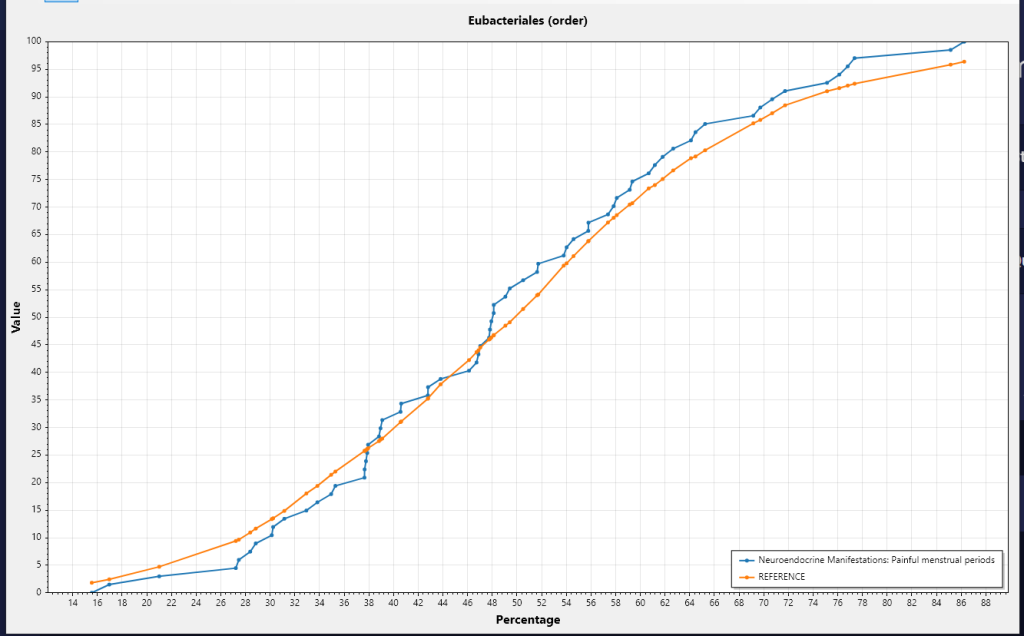
- The condition line is on both sides of the reference line, i.e. a complex situation.
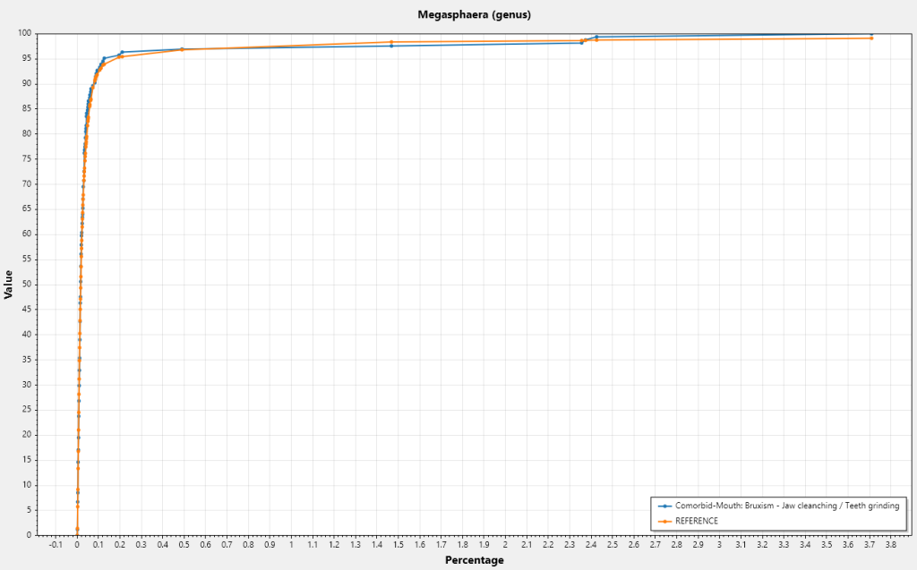
- The lines are on top of each other — no association to the symptom
Lower Transformed Average
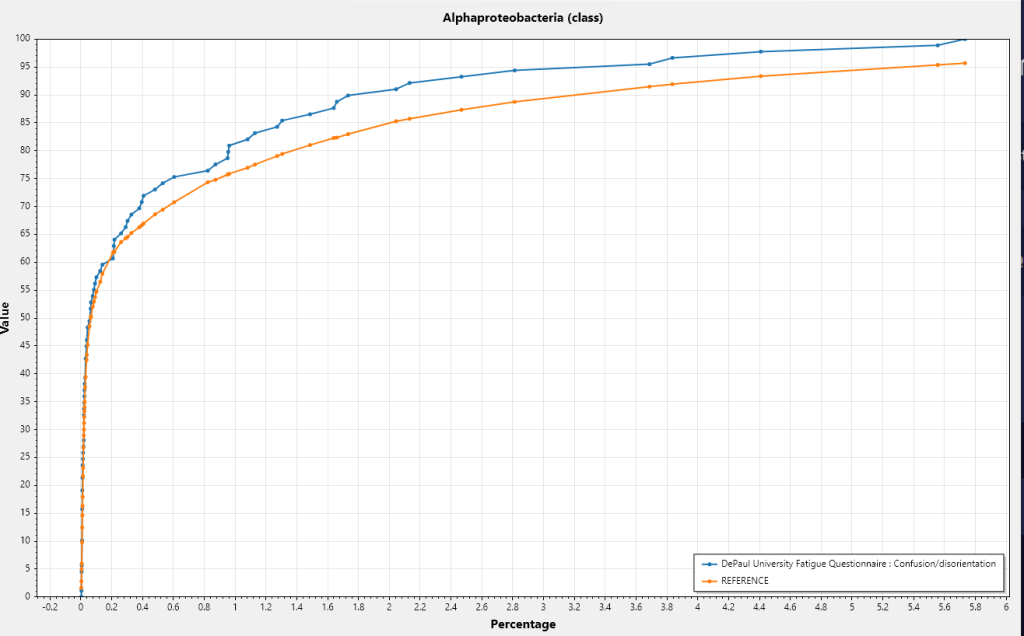
Higher Transformed Average
Mixed Case
No Association
A Video Show
I generated a program to walk through some random bacteria and recorded them in the video below. Pause the video when you want to look at a specific chart in greater detail. My main conclusion is that often a bacteria is significant only when it is in a certain range.
400+ more over 20 minutes
Recent Comments